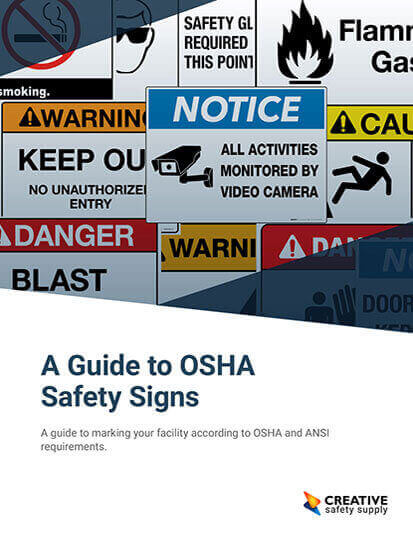
In 1971, OSHA released regulations, USASI Z53 and Z35 (ANSI 1967), regarding safety signs for workplaces. These regulations were a long time coming, and these signs helped protect workers from the hazards they faced on the job. The regulations proposed in 1971 then went unchanged for over forty years. Finally, in 2013, OSHA added ANSI Z535 (ANSI 2011) as a standard businesses could follow in addition to ANSI 1967 standards to be compliant. Since OSHA allows both standards, companies have the luxury (or burden) of choice. Both standards are compliant, and both have advantages and disadvantages.
Choices, Choices, Choices.
To keep your company safe and OSHA compliant, you have two choices when it comes to safety signs - which style best suits you?
Since OSHA's 2013 Safety Sign update, businesses have two guides to follow to stay OSHA compliant. Companies can either adhere to ANSI 1967 or ANSI 2011.
Since both styles are OSHA compliant, this gives business some freedom of choice. Take a look at the differences in the two styles below, and pick whichever better fits your needs.
Big differences:
 ANSI 1967 |  ANSI 2011 |
| Often calls for short, easily-understood messaging | Messaging is often used for longer, more complex messaging |
| Doesn't always use symbols | Standardized, universally-understood symbols appear on every sign |
| Messaging is centered and text is written in all caps | Messaging uses mix of upper and lower-case letters that reads from left to right, which can be easier to read |
| Doesn't always incorporate description of hazard or consequence and instructive emergency statement | Includes additional information, such as hazard description and emergency info, which adds additional protection for company |
Sign Types
Danger

What it looks like:
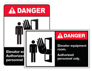
(ANSI 1967) Black/red header, white text states DANGER
(ANSI 2011) Red header, white text that states DANGER
What it means:
If hazard is not prevented, it will result in critical or fatal injury.
Warning

What it looks like:
Orange header, black text that states WARNING
What it means:
if hazard is not prevented, it could result in critical or fatal injury.
Caution

What it looks like:
(ANSI 1967) Black header, yellow text that states CAUTION
(ANSI 2011) Yellow header, black text that states: CAUTION
What it means:
If hazard is not prevented, it could result in minor, nonlethal injury.
Notice

What it looks like:
(ANSI 1967 and ANSI 2011) Blue heading, white text that states NOTICE
What it means:
Sign contains non-hazard-related information.
Safety Instructions

What it looks like:
(ANSI 1967 and ANSI 2011) Green header, white text that states SAFETY INSTRUCTIONS
What it means:
Message contains safety instructions or procedures.
ANSI Z535.1-2017
Every five years, ANSI reviews the Z535 series for industry changes or updates. In 2017, the standards institution revised standard Z535.1 and reaffirmed the other five standards. ANSI Z535.1-2017 was developed to establish a uniform system for safety colors, harmonizing with the ISO color requirements (ISO 3864-4:2011) and the Code of Federal Regulations Title 49 for Transportation. The Pantone colors originally specified in 2002 have also been updated.
The updated standard now includes definitions and references for a more friendly user experience. Additional annexes include color boundaries for Safety Yellow as well as how ANSI safety colors relate to ISO safety colors. Finally, ANSI has eliminated the use of Safety Gray and Safety Brown as hazard alerting colors.
Similar Articles
- ANSI Z535 [Updated Guide to Safety Signs & Labels]
- OSHA Safety Sign Requirements [1910.145]
- ANSI Color Codes for Pipe Marking
- Pipe Color Codes – ANSI/ASME A13.1
- Safety Colors (OSHA Guidelines and Color Codes)
- ANSI/ISEA Z87.1 Standard [Eye Protection + Safety Glasses]
- ANSI TIA 606-B Cable Labeling Standards
- Understanding OSHA/ANSI First Aid Kit Requirements
- OSHA Compliance: What You Need to Know
- What are ANSI standards?


