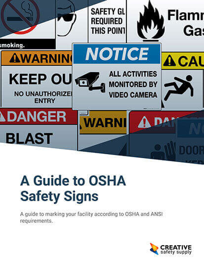
Safety signs and labels are only effective I they can be easily understood by an employee. The following are best practices to avoid common mistakes when posting safety signs in the workplace:
- Place signs where the can be seen: Signs that are placed too high will not be seen by workers, and warning labels on the back of a machine are completely ineffective. Place signs at a safe viewing distance, ensure signs will be seen from a worker’s point of view, and ensure signs are placed in well-lit areas. If a sign is needed in low-light, use a reflective sign.
- Details matter: A facility should not post safety signs with a vague message. For instance, a sign reading “DANGER: Confined Space” is too vague, but a sign that reads “DANGER: Confined Space. Enter by permit only” along with a symbol is a much more comprehensive and effective safety sign. Include symbols and safety instructions on the sign to ensure they’re properly understood.
- But not too many details: While safety signs should be detailed, it should not be overly detailed. Signs should not be so text heavy it makes it hard to understand or complicated for the workers.
- Keep signs and labels maintained: Dirty, torn, or otherwise compromised signs are hard to read and overall extremely ineffective. Maintaining signs and labels should be considered a task completed when machines, equipment, and the workplace is cleaned. Not only are clean signs more effective for safety in the workplace, signs will last much longer.
- Provide signs in more than one language: If workers speak more than one language, or workers are present where English is their second language, ensure they’re not left in the dark by providing safety and instructional signs in both English and the other language. Commonly workplaces have employees who speak Spanish and having English/Spanish signs will communicate with everyone in the workplace.
- Purchase or create signs that stand out: Workers will not pay attention to a safety sign blended into the wall. Signs should be bold and feature rich colors, so signs will be easily seen.
Similar Questions
- What do different symbols on safety signs mean?
- What does it mean to have OSHA/ANSI compliant signs?
- What do different colors of safety signs mean?
- What are types of signs in the workplace?
- Are safety signs just for the wall?
- What are different types of construction safety signs?
- What Are the most Common Types of Warning Signs in Industrial Settings?
- How Effective Are Danger Signs in Enhancing Workplace Safety?
- What are different materials of safety signs?


