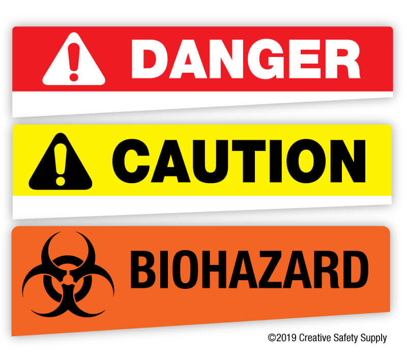
Warning signs and tags help prevent accidents and injuries in many workplaces. They are so common that most people don't consciously even see them. Despite the fact that they don't actively look at them, however, people can immediately recognize the warnings and their intended messages.
This is because OSHA has a lot of different requirements for what goes on these signs and tags. The specific layout and design of these signs and tags has been proven to quickly convey important messages, even when people hardly glance at them. All employers are required to put these types of signs and tags up whenever there is a serious hazard in the area. Learning about the OSHA requirements for these signs and tags can help ensure everything is in line with the established regulations.
The requirements discussed here come from the OSHA 1910.145 set of regulations.
Specifications for Accident Prevention Signs and Tags
Whenever using any type of accident prevention sign or tag, it is essential to understand all the requirements. If unapproved signs or tags are used, it not only puts those in the area at increased risk, but can also result in a citation from OSHA if it is discovered upon inspection.
Scope
The regulations listed in OSHA 1910.145 cover a variety of aspects of signs and tags. While it is permitted to use signs to warn people of hazards in addition to those listed in this area, other accident prevention signs and tags can't have the same design and appearance. The areas covered by this set of standards include:
- Design - All signs and tags must either be used in compliance with these regulations or have a sufficiently different design so as not to be confusing.
- Application - Signs and tags used for accident prevention must follow these regulations if the hazard that prompts the warning is within the scope of these standards.
- Symbols - Signs and tags used to comply with these OSHA standards must use approved symbols (when symbols are required).
- Text - The text on the signs must follow these standards to convey a clear message to readers.
- Exceptions - The specific exceptions for signs designed to prevent accidents include those used on streets, highways, and railroads. In addition, these requirements do not apply to general warning notices placed on bulletin boards or posters in the facility.

Definition of Sign
In this set of regulations, OSHA uses the term "sign" only to refer to any surface that has been set aside for use to warn of safety issues and/or provide instructions for how to avoid hazards. Signs can warn employees, the public, or both. OSHA specifically states that they do not consider any news releases, safety posters, bulletins, or other similar items signs (at least when it comes to this set of standards).
Classification of Signs
There are three main classes of signs within the scope of accident prevention signs. All signs used to comply with this set of regulations will fall under one of the following three classes:
- Danger Signs - Signs that alert people to specific and immediate dangers (including radiation hazards).
- Warning Signs - Signs that warn people of potential hazards that can lead to death.
- Caution Signs - Signs used to alert people to potential hazards. This class can also be used to caution people against certain unsafe practices. This class is for hazards that can result in minor (non-life threatening) accident or injury.
- Safety Instruction Signs - These signs offer instructions for how someone should act or perform to avoid possible hazards. The instructions can be either positive (do this!) or negative (do not do this!).
Some signs can also be used just as notices, but often aren't included as part of this overall set of standards because they have a different purpose. Notices can include things like identifying where an emergency eye wash station is located or where specific types of personal protective equipment are stored.
Sign Design
OSHA has specific requirements for the design of these signs. To start with, the sign itself must be safe. This means the corners must be rounded or blunted. The edges cannot be sharp and can't have any burrs, splinters, or other potentially hazardous areas. The bolts or other fasteners also need to be positioned so that they do not present any safety risk. As for the overall design of the sign, they must be in compliance with the ANSI Z535 safety sign standards.
The color requirements vary based on the class of sign:
- Danger Signs - These signs can use red, black, and white.
- Caution Signs - The background should be yellow, and any letters printed on the yellow background should be black.
- Safety Instruction Signs - The background of these signs should be white. The panel needs to be green with white letters. All the text printed on the white background should be black.
Sign Wording
Whenever a warning sign is used, the wording must be concise and easy to read. It also must be easy for the average person who would be reading it to understand, which means highly technical or scientific terms should be avoided. All wording should be made as a positive statement that reflects the facts of the hazards in the area.
Accident Prevention Tags

Accident prevention tags differ from signs in a variety of ways. One of the most significant is that tags can be applied to a specific item, which may be able to move around. Signs, on the other hand, are typically stationary and hanging on an immobile area (a wall, machine, etc.). Tags will also be smaller than signs, which means efforts must be made to fit in all the necessary information in a way that is still readable and conveys the desired message.
Signal Words
Accident prevention tags have specific signal words, which are located at the top of the tag. This is the word that immediately grabs the attention of the person working near the safety tag. The approved signal words for accident prevention tags are:
- Danger
- Caution
- Biological Hazard (Biohazard is also acceptable)
The words have the same usage as with signs.
Major Message
In addition to the signal words, an accident prevention tag should include a major message. This message explains what the danger, caution, or biohazard refers to. This message must be very brief and written in text that is easily readable. If using written text is not possible or is difficult, it is also acceptable to use approved pictograms that have a clear message. Some examples of acceptable major messages are:
- High Voltage
- Low Clearance
- Do Not Use
There are many approved major messages. These messages (whether text, pictograms, or both) must be immediately understandable by people who can be expected to see them. Safety tags used in a work environment should be understood by all the employees. Those used in public areas should have a very common meaning that the average person will easily understand.
Why Are Warning Signs & Tags So Restrictive?
OSHA's many requirements can get quite complicated. This can seem unnecessary at times, but having rigid standards helps ensure all facilities under OSHA's authority operate using the same rules. This offers many safety benefits including:
- Training - All employees, no matter where they have worked previously, will already understand the meanings of the warning signs and tags. This helps ensure they are safe from their very first day.
- Conflicting Information - Having a sign or tag mean one thing in one area and another in a different area can cause confusion, which can lead to increased risk.
- Mobile Products - Virtually all facilities today rely on other companies to produce products or parts that they use. If these products or parts are made in one area, they may arrive with a set of safety signs. Having all facilities follow the same OSHA standards ensures all these tags are the same no matter where they come from.
OSHA also knows these types of signs are only used in very specific situations. Rather than have a broad set of standards that applies to all signs in all facilities, OSHA wisely provides very narrow requirements that apply only to areas where there are real hazards. This allows employers to easily comply with the necessary requirements, while still having the flexibility to use their own internal visual communication options when necessary.
While it is certainly going to take effort to comply with these OSHA standards, in the long run it can save a lot of time and money, while also improving the safety of the workplace. Companies quickly find that remaining in compliance with these OSHA standards is worth the effort whether there were penalties involved for failure to comply or not.
Resources
- https://oshatraining.com/osha-training-blogs/
- https://www.osha.gov/laws-regs/regulations/standardnumber/1926/1926.200
Similar Articles
- Safety Colors (OSHA Guidelines and Color Codes)
- OSHA Sign Compliance: ANSI 1967 vs. ANSI 2011 [With 2017 Updates]
- OSHA Floor Marking
- Understanding OSHA/ANSI First Aid Kit Requirements
- ANSI Z535 [Updated Guide to Safety Signs & Labels]
- OSHA General Duty Clause
- OSHA Ear Protection Requirements (Standards for Hearing Safety)
- What is HAZCOM? (Hazard Communication Definition + OSHA Standards)
- Arc Flash Label Requirements [2018 Updates]


