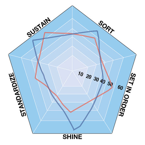

Also known as radar charts, polar charts, and star plots, a spider chart is often used to compare and contrast improvement and stagnation across multiple variables simultaneously, using a single graphical chart. Spider charts are used in Six Sigma as a means to control quality improvement and as represented in the image, these charts are called spider charts because once completed they often resemble spider webs. Using a spider chart can offer an easy (and less cluttered) way to graph out multivariate data.
For example, we will look at how a manufacturer can utilize a spider chart for analyzing a product. From the center of the chart, quantitative variables are represented on axes with a numerical scale. The axes extend to characteristics of the product and users typically chart between three and eight characteristics, the value of each characteristic is plotted along the axes and a line is drawn to connect the data values. Other products or competitor products can be mapped out on the same chart in a different color, making comparison much easier.
Managers can also use spider charts when trying to identify characteristics of a product necessary. They can map out what may need to be compromised and plot what is most important to meeting the customer’s needs and requirements while highlighting the possible trade-offs. Another use identified for radar charts is to graph the performance of an ongoing program or to analyze the skills of employees during a review process.
Appropriate for visually demonstrating outliers and commonalities between charts, spider charts excel at detailing progress over time. A well-designed spider chart offers comprehensive, useful information and context at a glance, giving viewers an immediate sense of the big picture. There are several different methods to create a spider chart. While a manager can use a traditional pen and paper, these charts can also be created in Microsoft Excel or another graphing software.
Similar Glossary Terms
- Yamazumi Chart
- Burndown Chart
- Pick Chart
- Levey Jennings Chart
- Box and Whisker Plot
- RACI Chart
- PERT Chart
- Control Charts
- Statistical Process Control (SPC)


